YEAR
[taxonomy date]
DELIVERABLES
Branding
Art direction
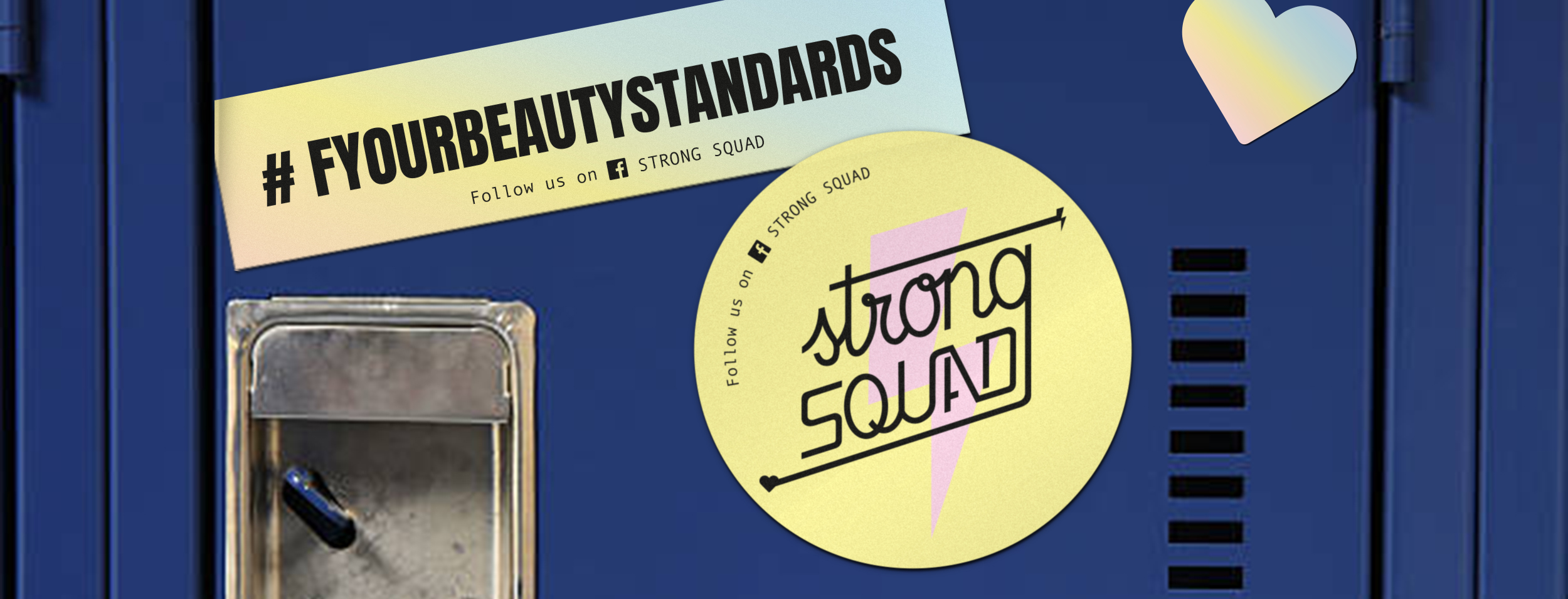
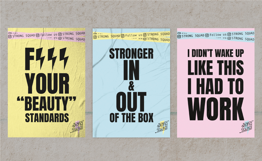
F*** your beauty standards
Strong Squad was born as a safe space for crossfit training aimed at LGBTQIA+ teens and women in Navan (Ireland). Far from aesthetic goals, the trainer Beatriz Ruiz de Aguiar wanted the users to be stronger inside and outside the box. The project includes naming, identity and design of corporate elements that serve as the basis for brand communications.

Radical support
Taking into account the target of Strong Squad, both the logo and the color palette are chosen with the purpose of creating a soft image, amicable towards future members and away from the imaginary created around crossfit. However, certain elements (the pure black color, the lighting bolt, even the name) turn Strong Squad into a meeting point of physical effort and mental and emotional empowerment.
Logo

Color palette

Typography

You got it, gurl!
Setting the tone in which Strong Squad addresses its audience is crucial. It is not just a space, it is a community, a family, a body, fat & gender positive movement. We take ourselves seriously, have fun in the process and pay no attention to whoever wants to make us believe that we are worth less for not complying with the standards of beauty and behavior.

